Monitor Calibration
& Colour Management
Getting accurate colour starts at your screen.
“If your monitor isn’t calibrated, what you see won’t match what we print — and no amount of lab quality fixes that gap.”
Every monitor displays colour differently. Calibration brings yours in line with an industry standard — adjusting colour, gamma, and luminance so that what you’re editing is what ends up in your print.
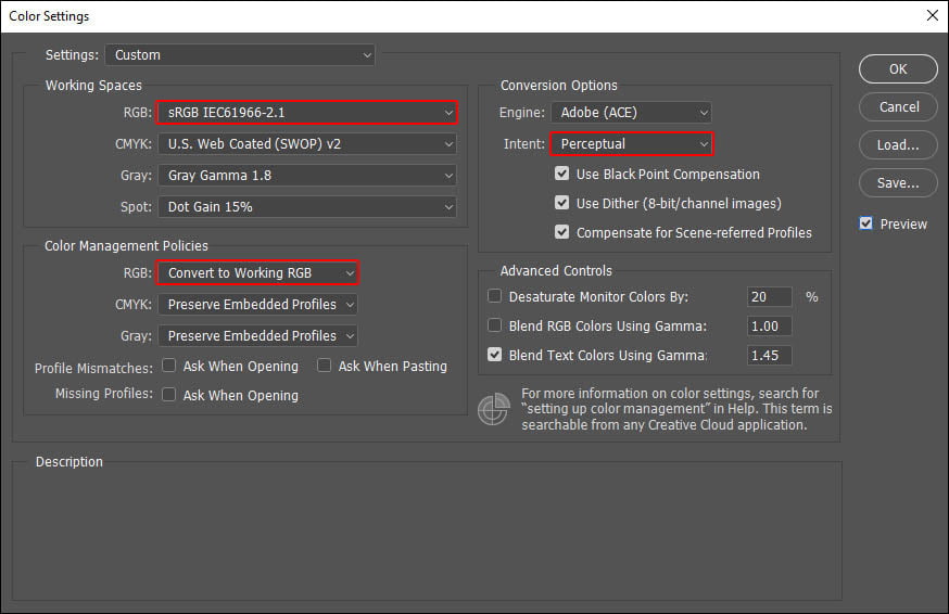
Photoshop — Colour Settings
Open Photoshop → Edit → Colour Settings and apply the following:
- RGB working space: sRGB IEC61966-2.1 for photographic prints (lustre/gloss). Adobe RGB 1998 for fine art inkjet and canvas.
- Colour management policies: Preserve Embedded Profiles
- Profile mismatches: Ask When Opening, Ask When Pasting
Save these settings — name them something like “BWP Lab” — and restart Photoshop to confirm they’ve applied.
Visual Calibration Steps
-
Set up your room
Work in a room with neutral walls and controlled lighting — ideally daylight-balanced fluorescent (CRI 95+). Avoid strong natural light hitting the screen directly.
-
Download the calibration image
Download our test target below and open it in Photoshop at 100% view on the centre of your screen.
-
Request the physical calibration print
We’ll post you a matching physical print at no charge — request one via our contact page or collect in-store during business hours.
-
Match your screen to the print
Hold the print alongside your screen under your working light. Adjust your monitor’s brightness, contrast, and colour controls until screen and print match in tone, density, and colour.
Lightroom — Export Settings
Lightroom always edits in a large internal colour space, so the key is what happens at export. Go to File → Export and under the File Settings panel set the following:
- Image Format: JPEG (or TIFF for large files or fine detail)
- Colour Space: sRGB for photographic prints (lustre/gloss). Adobe RGB for fine art inkjet or canvas.
- Quality: 100 for JPEG
- Bit Depth (TIFF only): 16 bit preferred
- Resolution: 300 ppi
Note: resolution at export doesn’t affect pixel count — it’s metadata that tells the printer the intended print size. Actual image quality comes from pixel dimensions, not the ppi setting.
Lightroom converts to your chosen export colour space on the way out and does not embed your monitor profile — which is exactly what you want. Make sure your export colour space matches the print type you’re ordering.
For monitor calibration itself, Lightroom respects your system’s display profile. Calibrating via a hardware colorimeter or your display’s built-in calibration utility will be reflected in how Lightroom renders colour on screen.
Saving Files for Print (Photoshop)
Save As → JPEG, maximum quality, Baseline Optimised, embed colour profile. For large files with fine detail or text, TIFF is preferred.
For prints up to 12×18″, keep the filename to 8 characters with no symbols. For larger prints any filename works — just remember to embed the colour profile.
Download Calibration Image
Download the test target below, open it in Photoshop, and use it alongside the physical print we’ll send you to dial in your monitor.

Need the matching physical print posted to you? Contact us and we’ll send one out at no charge.